

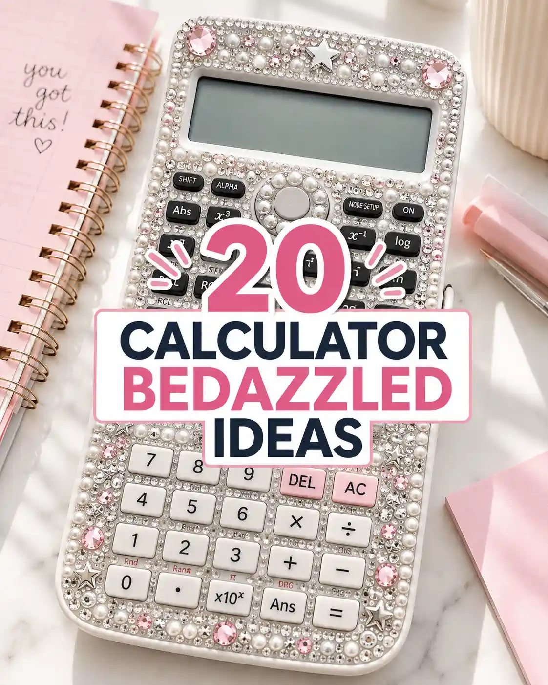
A calculator bedazzled with rhinestones, pearls, charms, or glossy gems can turn an everyday school essential into a small statement piece. The best designs keep the screen, solar panel, buttons, battery cover, and important labels clear while adding sparkle around the edges, case, or non-functional surfaces.
I love how something as ordinary as a calculator can become part of your personal style with just a few thoughtful details.Whether you lean toward coquette pearls, Y2K charms, clean crystals, colorful gems, or other bedazzling ideas, there is a design here that can work with your school supplies instead of making them harder to use. You can even coordinate your calculator with an aesthetic phone case, pencil pouch, or notebook without making everything look identical. The goal is simple: make your calculator feel more like yours while keeping it practical for everyday study sessions.
Key Takeaways
- Keep screens, keys, ports, and solar panels uncovered.
- Plan your rhinestone layout before adding adhesive.
- Match colors to your favorite aesthetic phone case.
- Use smaller gems around corners and narrow edges.
- Let adhesive cure fully before using the calculator.
- Store finished designs in a protective pouch.
What Makes a Calculator Bedazzled Look Good Without Becoming Hard to Use?
A good calculator bedazzled design adds decoration only to non-functional surfaces while keeping every button, display, panel, and access point easy to use.
At a Glance:
- Keep gems away from buttons.
- Leave the display completely clear.
- Avoid covering battery access.
- Use lightweight flat-back decorations.
- Build around one clear color theme.
The difference between a cute DIY and a frustrating one is placement. A successful bedazzled calculator adds texture and personality without covering the display, crowding the keys, blocking a solar panel, or making the calculator uncomfortable to hold.
For this CrochetMind roundup, the priority is simple: keep functional areas untouched, build the design around a clear color story, and use flat-back decorations that sit securely on the calculator shell.
Before you start, check the label on any glue, paint, or craft material you plan to use. The U.S. Consumer Product Safety Commission says art materials sold in the United States should carry appropriate hazard labeling and, when applicable, a statement showing conformance with ASTM D-4236 after toxicological review.
Quick Style Guide
| Look | Best Decorations | Color Direction | Difficulty |
|---|---|---|---|
| Clean glam | Clear rhinestones | Silver, clear, white | Easy |
| Coquette | Pearls, bows, tiny gems | Pink, cream, red | Easy |
| Y2K | Chunky gems, stars, charms | Hot pink, purple, chrome | Medium |
| Celestial | Stars, moons, crystals | Navy, silver, iridescent | Medium |
| Maximalist | Mixed gems, pearls, charms | Multicolor | Medium |
| Luxury-inspired | Uniform crystals, pearl borders | Black, champagne, gold | Medium |
If your adhesive has a noticeable odor, follow the manufacturer’s directions and work with good ventilation. The U.S. Environmental Protection Agency notes that concentrations of some organic compounds can be higher indoors than outdoors, and products used indoors can contribute VOCs to the air.
Which Calculator Bedazzled Ideas Are Worth Trying?
The best calculator bedazzled ideas combine a recognizable aesthetic with practical placement, from minimal pearl borders to bold Y2K charm layouts.
At a Glance:
- Choose one dominant aesthetic.
- Limit your main color palette.
- Use larger charms as focal points.
- Fill gaps with smaller rhinestones.
- Keep hand-rest areas comfortable.
20 Calculator Bedazzled Ideas That Make Study Time Look Better
1. Could a Full-Crystal Calculator Be the Ultimate Sparkle Look?
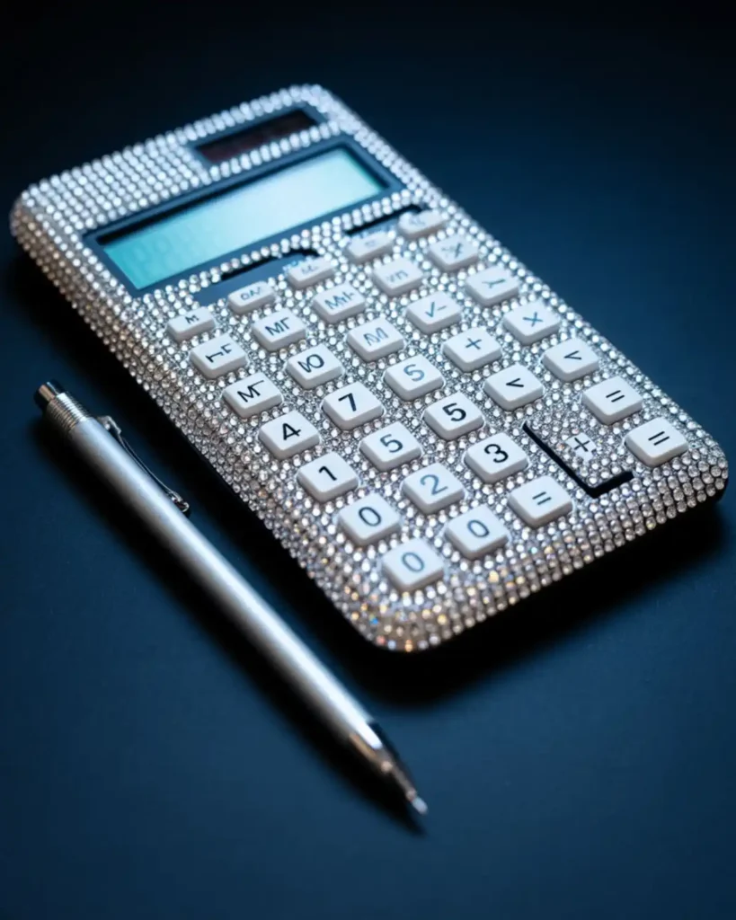
A full-crystal design makes the calculator look almost jewelry-covered, especially when small clear stones are packed closely around the outer shell. It feels more polished than using random large gems because the repeated stone size creates a cleaner surface. I would use this on a calculator that already has a simple black, white, or silver body so the shine becomes the main feature. It is best for anyone who wants maximum sparkle without introducing too many colors.
Work from the outside edge inward and stop well before the keypad. Using two or three rhinestone sizes can help fill tiny gaps without making the layout look messy.
Special Tip: Place the crystals dry first around corners and curved edges. Those areas usually determine whether the finished pattern looks intentional.
2. Pink Coquette Pearl Calculator
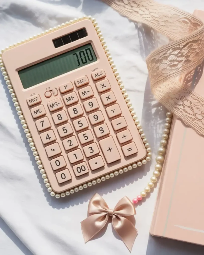
A pink coquette calculator mixes tiny pearls, soft blush gems, and miniature bow details for a sweeter version of the calculator bedazzled trend. Instead of covering every inch with rhinestones, the negative space keeps the design light and delicate. It works especially well beside pastel notebooks, ribbon bookmarks, and a matching pencil pouch, especially if you also enjoy crochet pencil case patterns for personalized school supplies. Choose this idea if you like romantic school supplies but still want the calculator to look neat.
Try a pearl border around the outer rim, then add small pink stones between the pearls. One flat bow charm near the lower corner can finish the theme without getting in the way of your hand.
3. What If You Mix Silver Rhinestones With Chrome Stars?
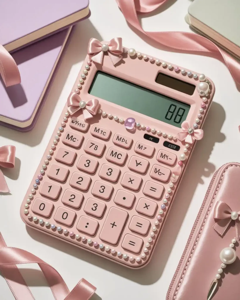
Silver rhinestones and chrome stars give a calculator a sharper Y2K look without relying on bright colors. The metallic finish reflects more light than pearls or matte charms, so even a small amount of decoration feels noticeable. This is the version I would pair with a metallic pen, silver binder rings, or a clear pencil case. It suits anyone who wants something futuristic rather than soft or floral.
Keep the stars spaced apart and use tiny clear stones as filler. A scattered layout often looks better here than perfect rows because it gives the surface a “night-sky in chrome” feel.
4. Could Red Heart Gems Make a Calculator Look More Playful?
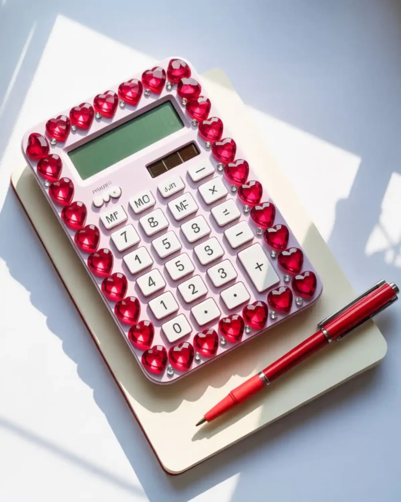
Red heart gems instantly create a bold, playful focal point, especially on a white, cream, or pale pink calculator. They stand out more than standard round rhinestones, so you need fewer pieces to get the same visual impact. This style is great for Valentine-inspired stationery or anyone who naturally gravitates toward cherry-red accessories. The best part is that you can keep most of the calculator uncovered and still make the design feel finished.
Place the hearts in a loose frame around the shell and fill only a few gaps with tiny clear stones. Avoid adding thick charms near frequently pressed keys.
5. Black Crystal “Night Luxe” Calculator
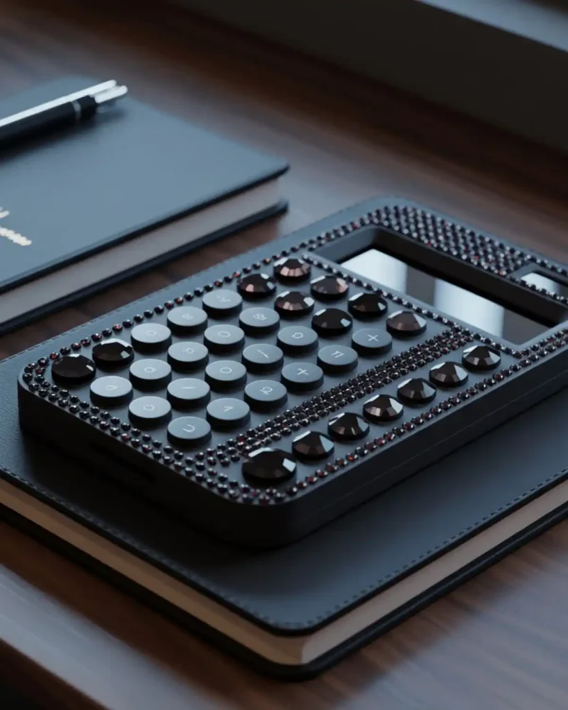
A black-on-black crystal calculator is one of the easiest ways to make sparkle feel grown-up. Clear gems can sometimes look very bright, while black crystals create a more subtle shine that changes as you move the calculator. I like this idea for a college desk setup with dark notebooks, a black laptop sleeve, or neutral accessories. It is a strong choice if you want glam without the sugary look of pink rhinestones.
Mix glossy black stones with a few smoky-gray crystals so the surface does not look flat. Keep the pattern symmetrical for a more expensive-looking finish.
6. Would an Iridescent Mermaid Calculator Catch More Light?
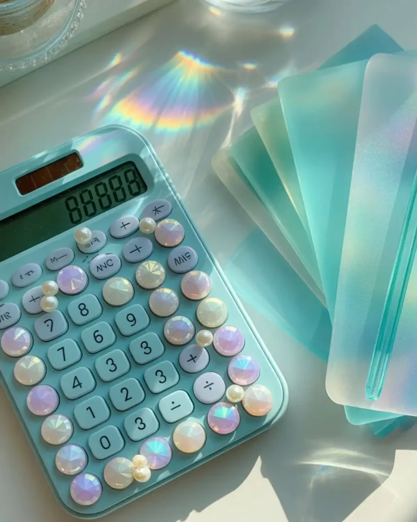
Iridescent rhinestones shift between blue, lavender, pink, and green, which gives even a basic calculator a dreamy mermaid finish. Unlike a single-color gem layout, the color changes naturally with the viewing angle, so the design stays interesting without needing many different materials. This would look especially good in a bright study corner where natural light can hit the stones. Pick it if you love holographic stationery or accessories that change color.
Use the iridescent pieces as the main material, then add a few tiny faux pearls for contrast. A pale blue or transparent calculator case makes the effect feel even lighter.
7. Could a Cherry Theme Make a Bedazzled Calculator Feel Retro?
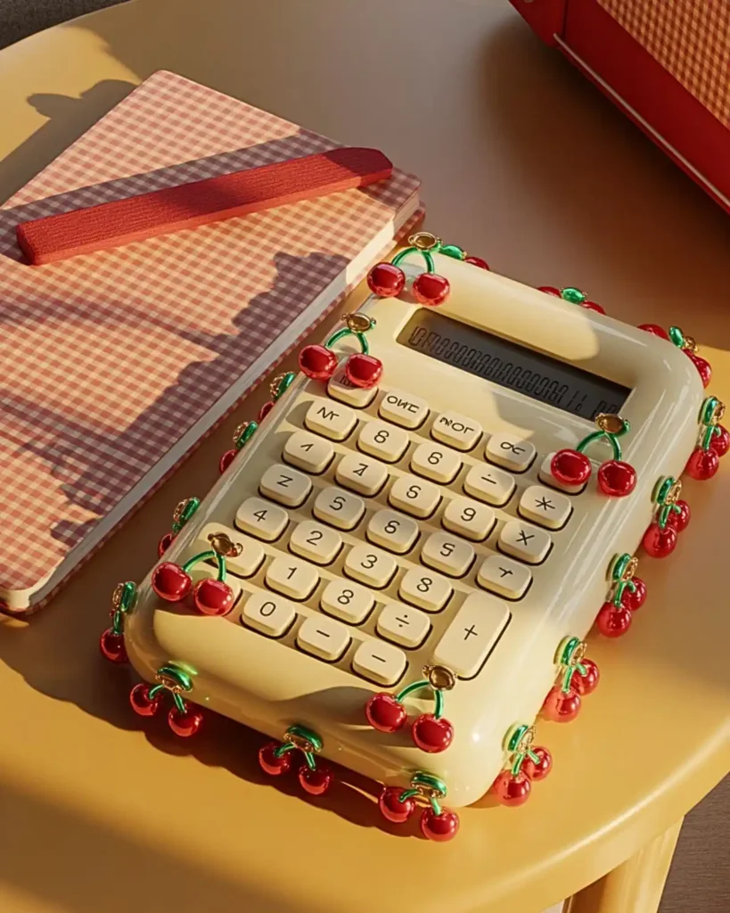
Tiny cherry charms, red gems, and green rhinestones create a retro-cute calculator that looks playful without becoming childish. A normal red-and-green palette can feel seasonal, but the cherry motif makes it more specific and recognizable. I would use the larger cherry pieces only near the corners, then let tiny stones carry the rest of the design. This works best for someone who likes vintage diner colors, gingham, fruit-themed accessories, or a colorful clay bead bracelet.
A cream or white base gives the red cherries enough contrast. If you already use an aesthetic phone case with fruit charms, repeating one or two of the same motifs can make your everyday accessories look coordinated.
8. Pastel Rainbow Rhinestone Calculator
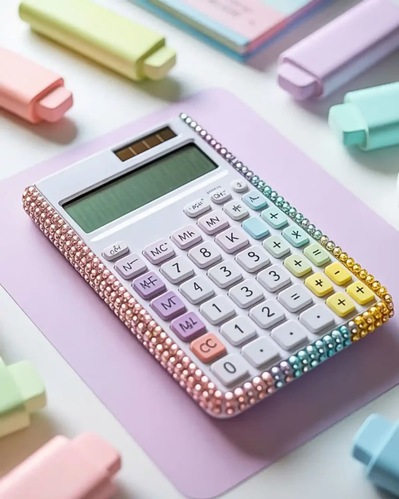
A pastel rainbow design uses soft pink, lilac, blue, mint, and yellow stones in bands or gentle gradients. It is calmer than a true rainbow because the colors share the same muted intensity. This is the calculator I would put into a pastel backpack where several colors already appear across the notebooks and pens. It is ideal if choosing one favorite color feels impossible.
Try arranging the shades from warm to cool rather than mixing them randomly. That small bit of order makes a multicolor design easier on the eye.
9. Can Tiny Daisy Charms Create a Soft Spring Look?
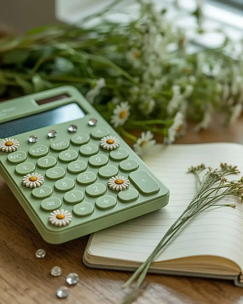
Tiny daisy charms turn a plain calculator into something that feels fresh, handmade, and spring-ready. Flowers offer more shape than round rhinestones, but using them sparingly keeps the surface from feeling crowded. This looks especially nice on sage green, butter yellow, baby blue, or white plastic. It is a good fit for anyone who prefers cottagecore and garden-inspired details over full glam.
Scatter the daisies around the border and place a small yellow gem in the center of each flower if the charm allows it. Leave visible space between clusters so each flower reads clearly.
10. What About a Blue “Study Sky” Crystal Gradient?
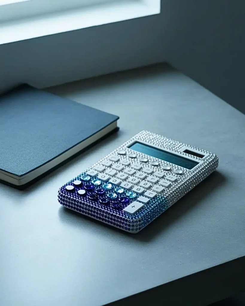
A blue gradient moves from deep navy stones to icy blue and clear crystals, giving the calculator a calm, organized look. It feels more designed than using one shade everywhere because the transition creates movement across the shell. I would place the darker stones near the bottom and fade upward toward the screen. This idea is perfect for a study setup built around cool colors.
Choose three to five related shades rather than every blue you can find. A controlled palette is what makes the gradient look smooth.
How Can You Match a Bedazzled Calculator to Your Personal Aesthetic?
Match your bedazzled calculator to your personal style by repeating one color, material, charm shape, or finish from accessories you already use.
At a Glance:
- Repeat one favorite color.
- Match metal finishes.
- Echo a charm motif.
- Coordinate without copying exactly.
- Keep the calculator functional first.
The easiest way is to borrow one visual element from accessories you already use: a color, charm shape, metal finish, or pattern. Think of it as the same styling logic behind searches for phone cases aesthetic inspiration—small objects look more intentional when they share a repeated detail rather than being identical.
11. Could a Gold-and-Pearl Calculator Look Vintage?
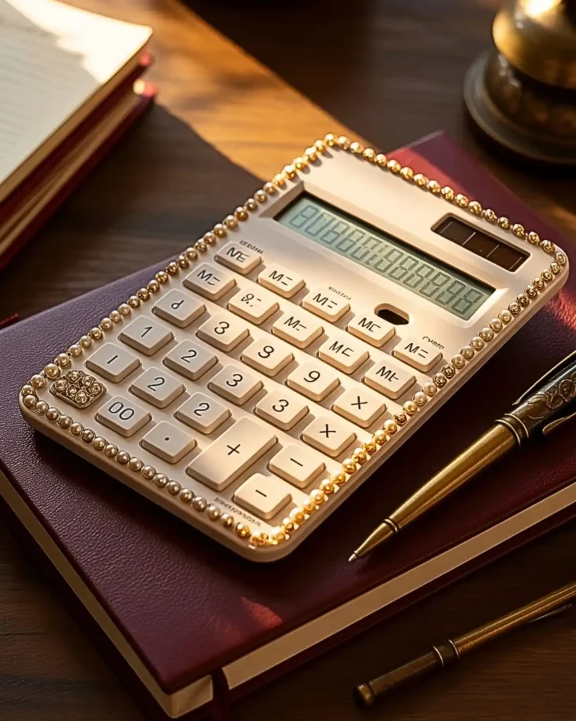
Gold stones and faux pearls give a calculator the feel of vintage jewelry without needing oversized decorations. Compared with silver rhinestones, gold warms up cream, beige, brown, and burgundy calculator shells. I would use it with a leather-look notebook or classic academic desk setup. It is best for someone who wants decorative stationery that still feels sophisticated.
Use tiny gold rhinestones as the base and pearls as occasional focal points. Too many large pearls can make the calculator bulky, so keep the biggest details near the outer corners.
12. Purple Butterfly Gem Calculator
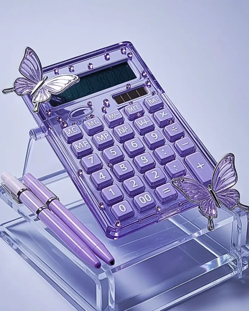
A purple butterfly design combines lavender crystals with a few flat butterfly charms for a dreamy early-2000s aesthetic. Butterflies create more personality than a plain gemstone border, but they still look cohesive when every piece stays within the same color family. This one belongs beside purple highlighters, translucent folders, glitter pens, or handmade polymer clay earrings in the same lavender palette. Choose it when you want a recognizable motif instead of an abstract sparkle pattern.
Try placing one butterfly near the top corner and another diagonally opposite. Fill the remaining space with small lavender and clear gems.
13. Would a Checkerboard Rhinestone Pattern Look More Graphic?
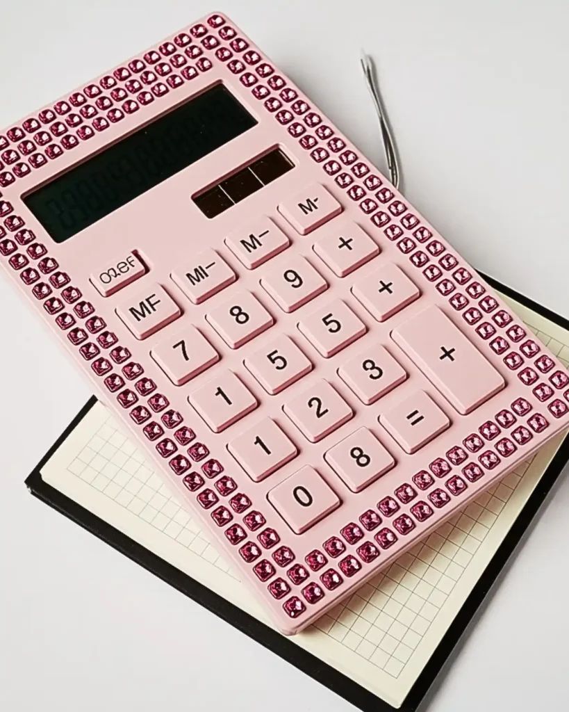
A checkerboard layout turns tiny square or round stones into a crisp graphic pattern rather than a scattered embellishment. It stands apart from typical bedazzling because the design depends on repetition and contrast, not just shine. I would try black-and-white, pink-and-white, or lilac-and-clear combinations on a calculator with broad flat edges. It works best for someone who likes bold patterns and clean lines.
Mark a light guide before gluing so the rows stay aligned. Even a small shift becomes obvious in a checkerboard pattern.
14. Pearl Border With Minimal Clear Gems
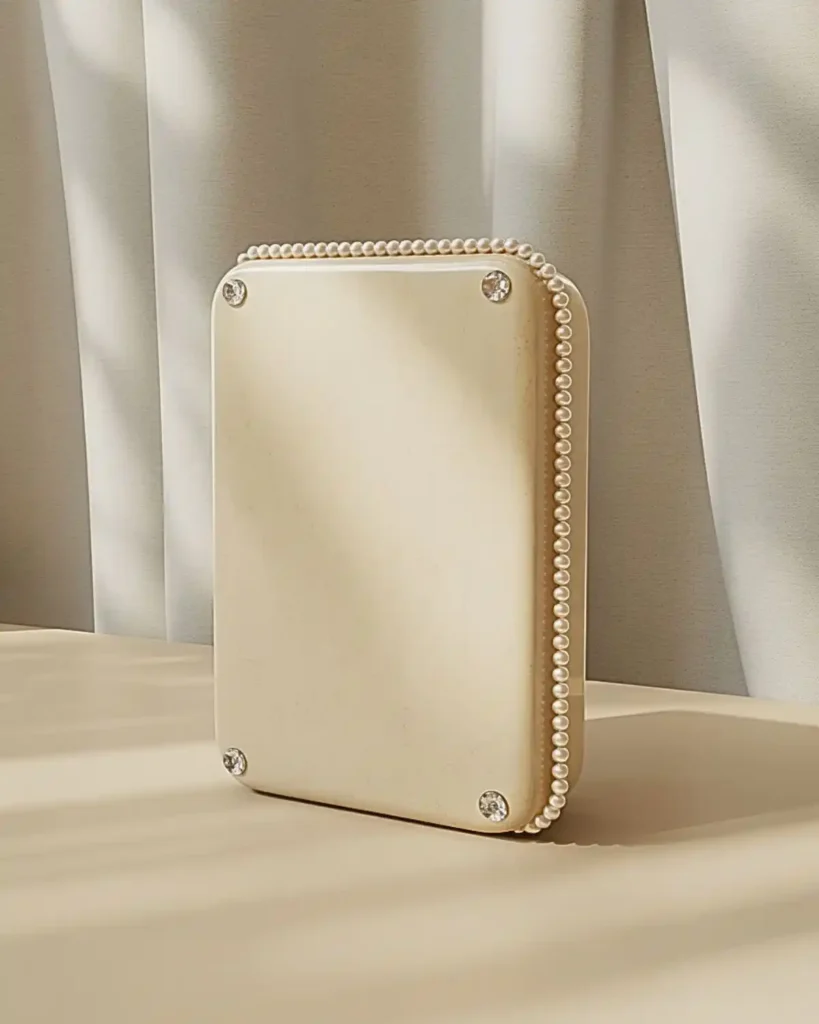
A simple pearl frame proves you do not need to cover the whole calculator to make it look customized. The soft pearl texture gives more visual interest than leaving the shell plain, while the clear gems add just enough sparkle. This would be my choice for a calculator you use every day and want to keep comfortable in your hand. It is ideal for minimalists who still want a little glamour.
Run one narrow row of small pearls along the outside border and add clear stones only at the four corners. The result looks intentional and is easier to maintain than a fully covered surface.
15. Could a Zodiac Calculator Make the Design Feel Personal?
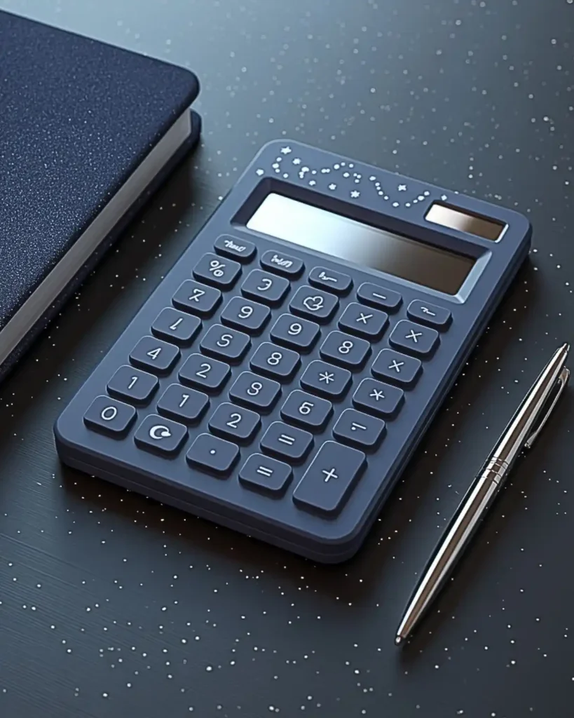
A zodiac-themed calculator becomes personal with a constellation symbol, star charm, or tiny birthstone-colored rhinestones. It has more meaning than a generic star pattern because the colors and symbols can connect to a specific sign. This is a fun choice for a study desk where you already display a zodiac mug, journal, or pendant. It works especially well when you want the calculator to feel uniquely yours.
Use one larger zodiac symbol as the focal point, then surround it with sparse stars. Dark blue, black, or clear calculator shells make silver celestial details stand out.
16. What If You Use Monochrome Pink From Edge to Edge?
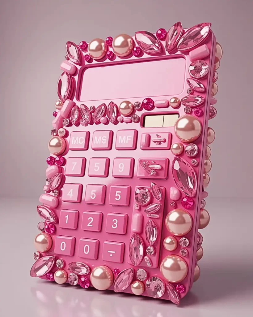
A monochrome pink calculator uses several finishes glossy rhinestones, matte pearls, jelly gems, and transparent stones—without leaving the pink color family. The texture variation keeps it from looking flat, which is the main risk when everything is one color. I would match this with a pink aesthetic phone case rather than trying to make the two pieces exactly identical. This is for anyone who wants a strong signature color across their everyday accessories.
Start with the largest pink accents, then fill the gaps with small rhinestones. Keeping the key area clean will stop the design from becoming visually overwhelming.
17. Could Clear “Bubble” Gems Create a Clean Kawaii Look?
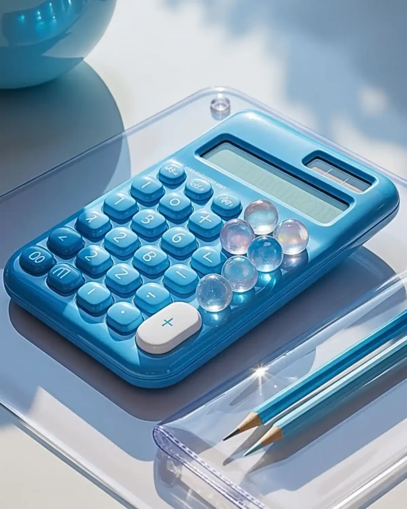
Clear rounded gems create a bubble-like surface that feels cute, glossy, and lighter than heavy crystal coverage. They reflect the calculator’s base color, so the same materials can look completely different on pink, blue, white, or black plastic. I like this idea for transparent stationery and jelly-style accessories. It is best for someone who wants dimension without a busy multicolor palette.
Mix clear domes with a few opalescent pieces for subtle variation. Make sure no raised gem sits where your palm naturally rests.
18. Y2K Mix-and-Match Charm Calculator
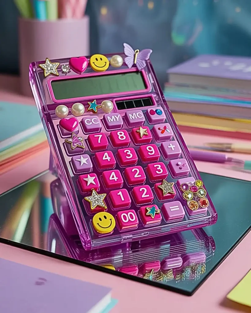
A Y2K mix brings together stars, hearts, smiley faces, butterflies, pearls, and bright rhinestones in one deliberately busy layout. Unlike a neat crystal grid, the appeal comes from variety and the sense that each charm was collected separately. This is the design I would build around a clear or pale calculator so every colorful element has room to pop. It suits maximalists who think “too much” is exactly enough, especially if you also like colorful friendship bracelet patterns and mixed accessory styles.
Limit yourself to three main colors even if the shapes vary. That one rule keeps the finished calculator playful instead of chaotic.
19. Can a Green Botanical Calculator Feel More Grown-Up?
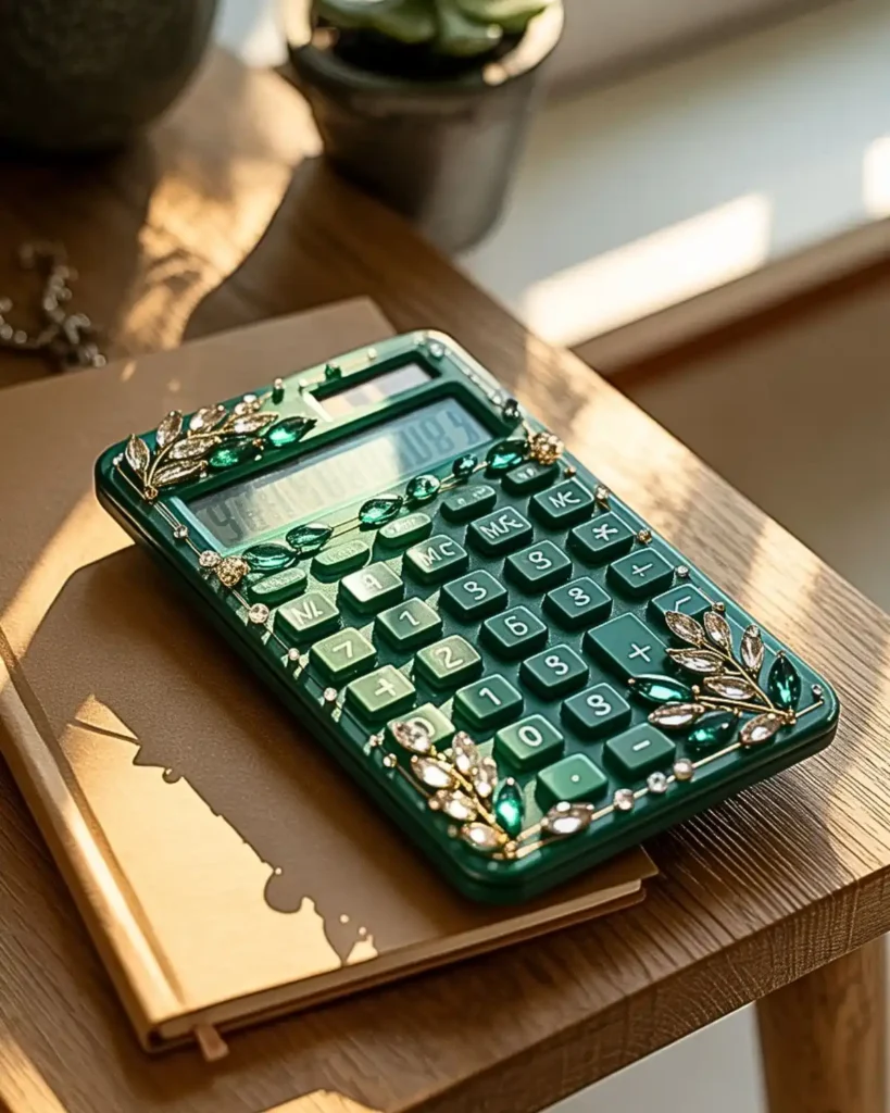
Emerald, sage, and clear stones paired with tiny leaf charms create a botanical calculator that feels polished rather than sugary. Green gives you more depth than a standard floral pastel design, particularly when darker stones are used around the edges. I would pair it with a kraft notebook, neutral pencil pouch, or plant-filled desk. It is a good option for someone who wants nature-inspired craft details without using bright flowers.
Use leaf charms as accents and keep most of the coverage in small green rhinestones. A few pearl or clear pieces can soften the deeper shades.
20. Could a Personalized Initial Calculator Be the Best Final Touch?
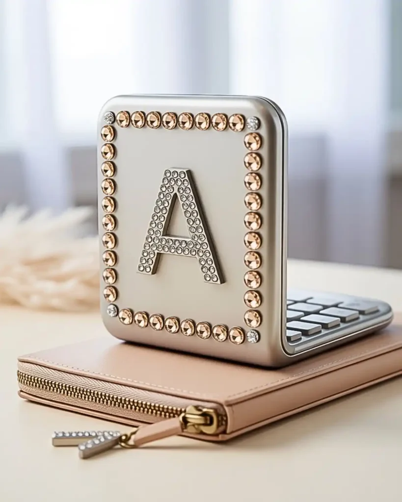
A rhinestone initial makes the design instantly personal without requiring dozens of different charms. It is cleaner than spelling a full name, and the single letter can become the focal point of the whole calculator. I would place the initial on the back or a wide lower corner, then build a simple border around it. This is probably the best option for gifting because you can customize the same basic idea for almost anyone.
Use a contrasting stone color for the letter so it stays readable. For an extra coordinated look, repeat the same initial charm on a pencil pouch or phone accessory.
What Supplies Do You Need to Bedazzle a Calculator?
You need flat-back decorations, a surface-appropriate adhesive, a rhinestone picker or tweezers, and simple tools for clean placement.
At a Glance:
- Choose flat-back gems or pearls.
- Use adhesive made for the surface.
- Keep tweezers nearby.
- Protect functional areas with tape.
- Clean the calculator before decorating.
You do not need a huge craft kit. A small, controlled set of materials makes placement easier and reduces clutter.
- Flat-back rhinestones, pearls, or lightweight charms
- An adhesive suitable for the calculator’s plastic surface
- Wax pencil or rhinestone picker
- Tweezers
- Toothpick or precision applicator
- Cotton swab or soft cloth for cleanup
- Low-tack tape for marking areas you do not want to cover
If you are buying art or craft materials in the U.S., CPSC guidance says art materials should carry the required safety labeling, and its labeling overview notes the “Conforms to ASTM D-4236” statement after toxicological review.
Also treat rhinestones and charms as small parts. CPSC guidance specifically identifies small parts as a choking, aspiration, or ingestion hazard for children under three, so keep loose gems and unfinished projects out of their reach.
How Do You Bedazzle a Calculator Step by Step?
Clean the calculator, plan the layout, protect functional areas, attach the largest decorations first, fill gaps with smaller gems, and allow the adhesive to cure fully.
At a Glance:
- Clean before decorating.
- Map out the design first.
- Protect buttons and access points.
- Attach focal pieces before fillers.
- Follow the adhesive curing instructions.
Start by turning the calculator off and cleaning the exterior so dust, oil, and residue do not interfere with your layout. Do not apply liquid directly into seams, around the display, or between keys.
- Photograph the calculator before decorating it so you can remember every label and functional area.
- Plan the design without glue and identify the screen, keys, solar panel, ports, battery access, and screws that must remain uncovered.
- Mark a safe decoration zone with low-tack tape.
- Apply small amounts of adhesive according to its label directions.
- Place the larger focal charms first.
- Fill gaps with smaller rhinestones or pearls.
- Remove excess adhesive before it fully sets, following the product instructions.
- Allow the adhesive to cure for the full manufacturer-recommended time before using or packing the calculator.
For stronger-smelling adhesives, use good ventilation and follow the product label. EPA notes that VOCs from indoor products and materials can affect indoor air quality, so “more glue” is not automatically better.
How Do You Keep a Bedazzled Calculator Looking Good?
Protect your bedazzled calculator from friction, moisture, and rough handling, and replace loose decorations instead of layering new adhesive over them.
At a Glance:
- Store it inside a pouch.
- Avoid soaking the surface.
- Clean gently around gems.
- Reattach loose pieces properly.
- Keep battery access uncovered.
Store it in a pouch instead of tossing it loose into a bag with keys, chargers, and metal stationery. Repeated rubbing is more likely to loosen raised decorations than normal button use.
Clean around the gems with a dry or barely damp soft cloth rather than soaking the surface. If one stone loosens, remove it completely and reattach it according to the adhesive maker’s directions instead of layering fresh glue over a failing bond.
Most importantly, keep access points clear. A beautiful calculator is still a tool, so battery covers, screws, charging ports, solar panels, and labels you may need later should stay usable.
Frequently Asked Questions
Can You Bedazzle Any Calculator?
You can decorate many plastic calculator shells, but the exact method depends on the surface and the manufacturer’s design. Keep the screen, keys, solar panel, ports, screws, and battery access free of glue and decorations.
What Glue Should I Use for a Bedazzled Calculator?
Use an adhesive whose manufacturer states that it is suitable for the calculator’s surface and the type of rhinestones or charms you are attaching. Read the safety and curing instructions rather than assuming one craft glue works for every plastic.
How Do I Stop Rhinestones From Falling Off?
Clean the surface first, use only the amount of adhesive recommended, and allow the full curing time before handling the calculator. Flat-back decorations also give you more contact area than many bulky pieces.
Can I Match My Calculator to My Phone Case?
Yes. Repeat one feature such as pink pearls, silver stars, cherry charms, or iridescent stones rather than copying the entire design. That keeps a bedazzled calculator coordinated with an aesthetic phone case while still letting each accessory have its own look.
Is a Bedazzled Calculator Safe for Children?
Loose rhinestones and charms are small parts, so extra care is needed around young children. CPSC says small parts can present choking, ingestion, and aspiration hazards for children under three.
Final Thoughts
A calculator bedazzled with the right mix of rhinestones, pearls, or charms can be both functional and genuinely personal. The strongest designs do not simply add more sparkle—they use a clear theme, leave working areas untouched, and repeat colors or motifs that already fit your stationery style.
Start with one of the simpler ideas, such as a pearl border or clear crystal frame, if this is your first attempt. Once you know how your materials behave, you can move into gradients, checkerboards, celestial themes, or maximalist Y2K layouts.
For more creative DIY inspiration, explore CrochetMind and build a study setup that feels as considered as the accessories you carry every day.

![The Best 30+ Free Crochet Cat Patterns [Beginner-Friendly Guide]](https://crochetmind.com/wp-content/uploads/2025/04/1-The-Best-30-Free-Crochet-Cat-Patterns-Beginner-Friendly-Guide.webp)